I’ve recently successfully completed at coursera.org in data analysis, and several courses that make use of the R language. Feeling flush with my new-found powers, I looked around for something to analyze, and the recent federal budget speech caught my attention. I created (and tweeted) a quick&dirty word cloud picture of the budget … that’s a diagram created from the most popular words in a text document, with the size of the words proportional to how often that word is used. Real pretty, but pretty empty of quantitative usefulness. So I did a bit of research and discovered a rather nifty technique for analyzing textual documents, correspondence analysis. And thus began my decent into figuring out how to use this to analyze budget speeches, then a search for as many budget speeches as I could find (that took a while!). After tinkering with data and algorithms and code (oh, my!) I came up with some rather intriguing (to me, at least) results. Here’s the rather formal
Using Correspondence Analysis to Analyze Cdn Federal Budget Speeches 1966-2013
Here’s the data and code for the analysis :
CorrespondenceAnalysisPrograms
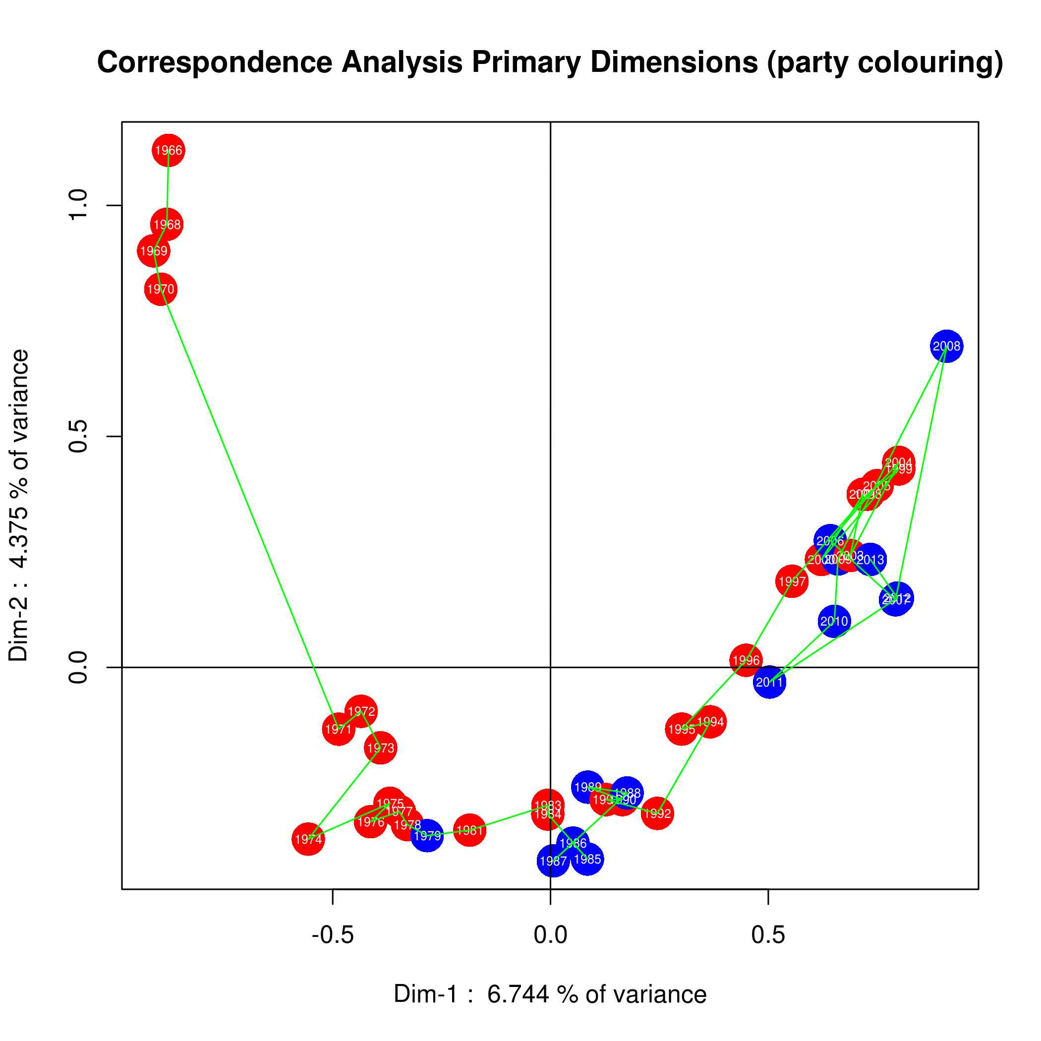
As a teaser (or for those of you who just want a pretty picture) here’s a diagram that summarizes the results. It’s amazing how much work goes on behind the scenes to produce a single pretty picture! To summarize, I analyzed each budget speech and reduced it to a set of numerical values (“dimensions”). This plot shows each budget speech plotted on a X-Y plot, showing how each varies in relation to all the others. Curiously, it shows how the budget speeches evolve over time (as opposed to random changes), and how the budgets tend to get tweaked for elections (surprise, surprise).
Anyways, I had a LOT of fun playing around with this, and plan to do some more. Hope you enjoy it!
[February 5/14 … the links to the report and files got broken, but are now fixed]
Adding the words on the map will enrich the interpretation.
Thanks for the comment! I actually tried as you suggest, but the diagram was so crowded that the words could not be distinguished. While experimenting with alternative types of diagrams, I decided that the shape of the curve was more informative than the words themselves. I agree with you that some description of the words is valuable, and Table-3 of my paper shows the top 20 words in each of the budget speeches.